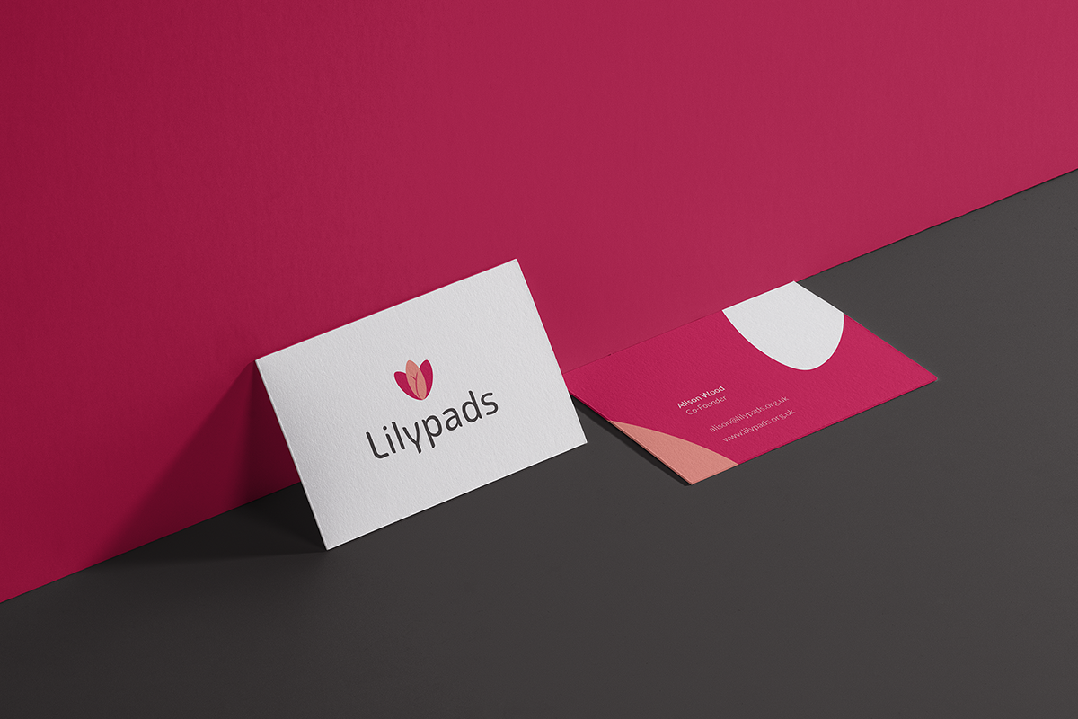
- by Luís Medeiros
Phase 0: Meeting Lilypads
Before officially launching Double-W, it was of paramount importance to actually test our newly designed process in a real branding project. A perfect opportunity to put theory into practice, but we needed a client that would be willing to embrace more than our ‘normal’ collaborative branding process. We needed someone who would be available to sit with us and discuss the tools, procedures and their relationship with the branding team, throughout the whole project. And, as a reward for their “guinea-pigging”, they would receive their new brand completely free of charge.
So, we launched an international contest to find the Starting Company that could be our first client-come-test-subject. It was important to us that we could find a project that embodied the reasons behind the design of Double-W: to connect with changemakers, driven people with a thirst for meaningful impact. We found the perfect match when Alison applied with her brand, Lilypads.
Their story touched us right on the feels. Here’s a short part of their application:
“I don't believe any person should have to choose between their health and their education, especially because of a natural biological process... The effects on their self-worth are immeasurable. Join us and help provide another solution to women all over the world.”
Alison had joined forces with three colleagues from the University of Edinburgh to create a business, selling sustainable female sanitary pads in the UK to subsidise education initiatives and the delivery of sanitary pads to girls and women in need in Kenya. More than just an environmentally sustainable product, a tool for women to tackle period poverty through their bodies.
But to successfully achieve their goals, Lilypads needed to evolve from a touching story that people can identify with, to an appealing product with a clear purpose and results that inspire customers to join the journey. They needed to become a brand; and use this as a platform to spark change, all while communicating trust and reliability to their primary users.
Time to get down to work.
Phase 1: Research & Strategy
Understanding female hygiene rituals and defining a target
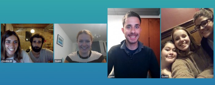
At our remote Kick-Off, our Project Manager, Maria, introduced Alison, Mhairie and Bronnie to the Branding Team. Graphic designer Alex was the first ever freelancer to enter our Talent Pool and Luís, our in-house copywriter, would assume wordsmithing duties, as we felt the need to be a little closer to the first-ever run of our process.
Using the Pre-Kickoff workbook as a starting point for discussion, the whole Project Team (client included!) were now able to understand the values that Lilypads could reflect in a sincere manner; and also align in terms of what were the base motivations and more generic aspirations for the brand. The meeting also allowed for a quick outline of the overall market and different types of competitors. But there was one dimension that, although briefly discussed, still lacked the level of deep understanding required to devise a pertinent strategy: women, and their relationship with female hygiene products. And that’s what our research would focus on during the following couple of weeks.
So, besides engaging in a streamlined benchmark, where we analysed the way the most relevant competitors communicated and positioned themselves (and also delved into some analogous examples of purpose-embedded companies), we dedicated a lot of time to get to know as many different users as we could. Taking time to understand the specifics in each use case. We conducted a survey and multiple interviews with women from the UK, as well as some living in other places in the world, and even managed to sit down for a conversation with a former Director of Healthcare Education for NHS Scotland.
This short but intensive research phase helped us in devising a focused strategy. We amassed enough information to craft some comprehensive journey maps, which helped us (together with further analysis of the competition) in better defining what our actual target should be. If The Brand Was, an exercise for abstraction, allowed for the Client Team to paint a pretty comprehensive picture of what the brand should represent for our target.
Lilypads started out with the ambition to conquer the world. But by the end of the strategy phase, we had helped to define some more sustainable goals for the first years of the brand. And with a more focused target, came a smarter positioning, fitting an honest brand personality, as reflected in the brand’s essence: “Be comfortable in your choices” was the phrase that encapsulated what Lilypads brand was now set to become. A comfortable platform for anyone who cares about the impact they are responsible for when choosing products.
TL;DR -> Kick Off -> Research (benchmarking, analogous research, interviews) -> Strategy (Brand VIsion framework, competitor analysis, journey map) -> Brand Essence: Be comfortable in your choices
Learnings: Research and Strategy
- Frameworks were successful in informing our research and allowing us to quickly understand where we should dive deeper.
- The research phase was very beneficial to the client team, fuelling internal conversations and helping them to align around a common vision.
- Appear.in presented a lot of problems and crashes, during our first remote meetings. We quickly migrated to Google Hangouts, which would prove to be a much more stable platform.
- Remoteness, coupled with scheduling mismatches, made us realise that our best results still come from real-time conversations.
Improvements:
We now ensure that each project team has (at least) one dedicated time-slot every week for synchronous work. These moments - although planned - provoke spontaneity; giving our teams the space to bring things they believe in to the table, find interesting analogies, and create solutions together.
Phase 2: Direction and Exploration
On to the drawing board
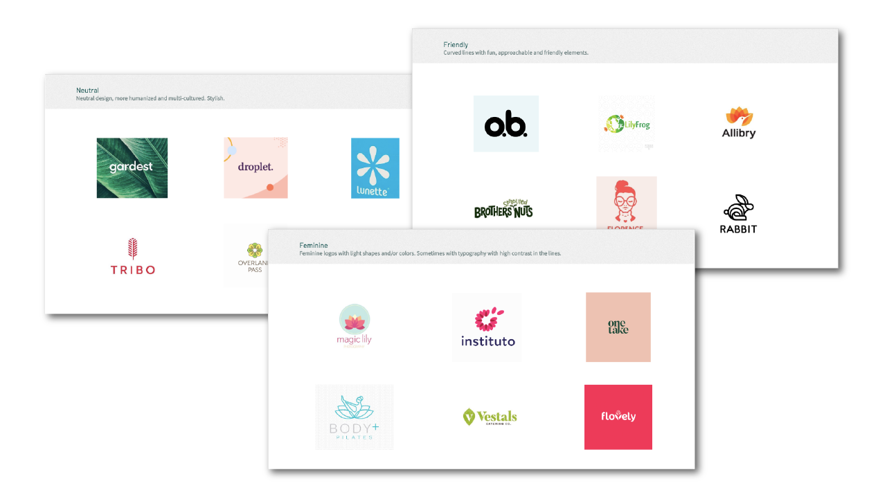
With our newly conceived Brand Essence in mind, it was now time to start giving shape to the values and characteristics that we identified as having the potential to connect with our target in an honest fashion. This started, again, with a moment of co-creation: in our Thematic Exploration framework, Lilypad’s team was presented with the task to analyse various graphical universes and visual references - carefully pre-selected by the Branding Team - and to comment on them. It is clear to us that there are multiple great ways of visually portraying a brand. Our role is not to force our personal taste onto clients but to potentiate the languages they are the most comfortable with, making the visual (and verbal) identity feel natural and true to the brand.
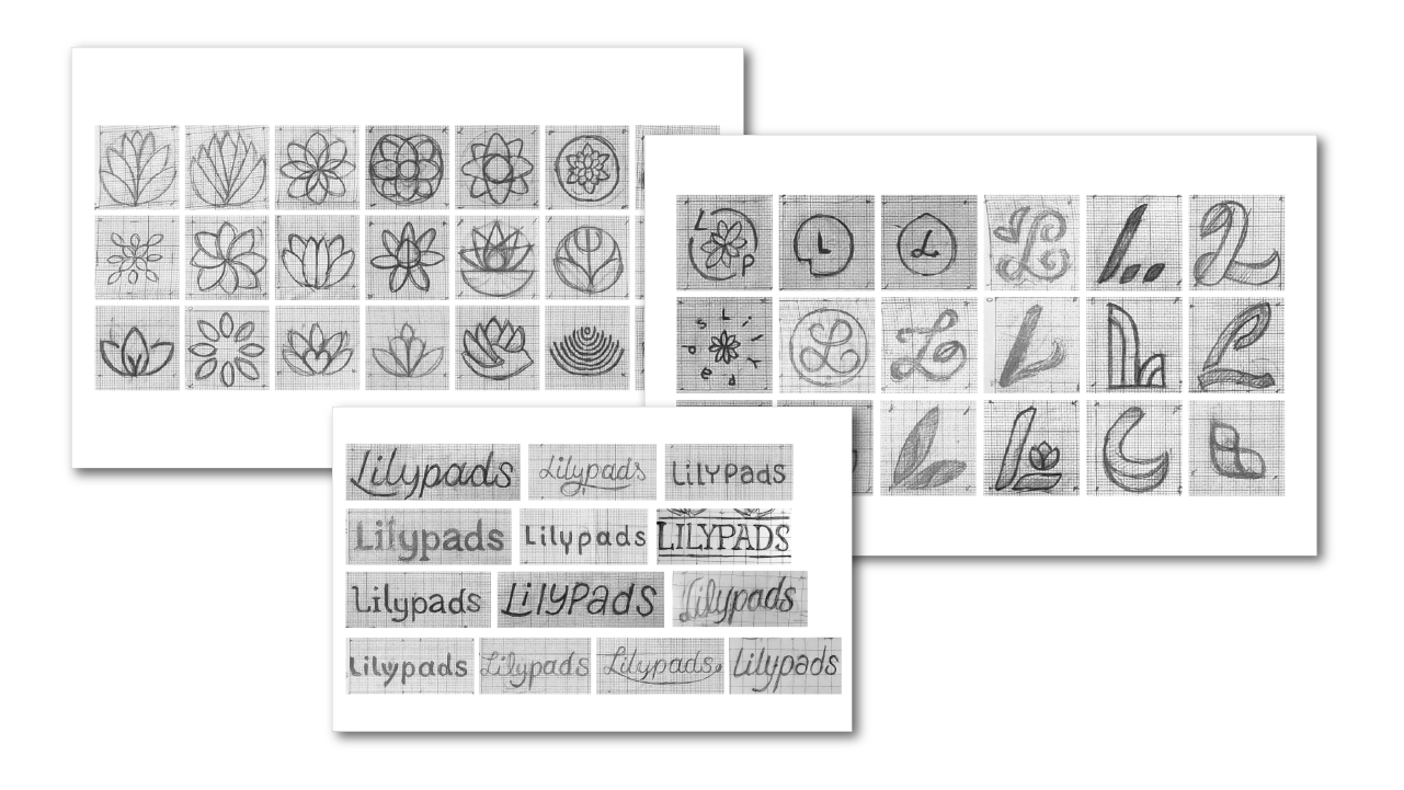
The framework sparked some useful conversation between the whole Project Team, and Alex was able to start sketching. Out of 60+ very early sketches - that were shared and discussed with the Client Team - we were able to narrow it down to three different options. But, in all honesty, we were just trying to remain somewhat faithful to the process and guarantee we were not skipping steps. The truth is everyone was drawn, right from the start, to a very powerful, yet elegant shape: a lilypad flower embracing a feminine figure, that embodied (no pun intended) everything we felt the brand stood for.
While the logo was being refined and perfected, more benchmarking would ensue. This time, our goal was to understand how our direct and indirect competitors used colour, and how Lilypads could differentiate from them, while still maintaining the brand’s language. In parallel, Alex selected a font that we would go on to use as a basis for the final lettering (we worked on that later on).
On the verbal side of things, developments also took place. We needed to establish some characteristics that would better define Lilypad’s tone of voice, giving the Client Team a clear set of guidelines on how to talk in a compelling way with their audience. Again, for this to be done correctly, these characteristics shouldn’t just fit what we thought to be better for the brand itself. We wanted to craft a personality that Alison and the rest of the team would be comfortable with, that had the “I have known this person brand for a very long time” feeling.
We went all the way back to the Brand Vision Framework, where there was only one answer shared by every single team member: If the brand was a personality, it would be Emma Watson. That not only made a lot of sense to us, but it also made our job much easier. By studying the way Emma used social media and talked in interviews or speeches, we were able to abstract a set of guidelines that instantly felt familiar and easy to use to Lilypads’ team!
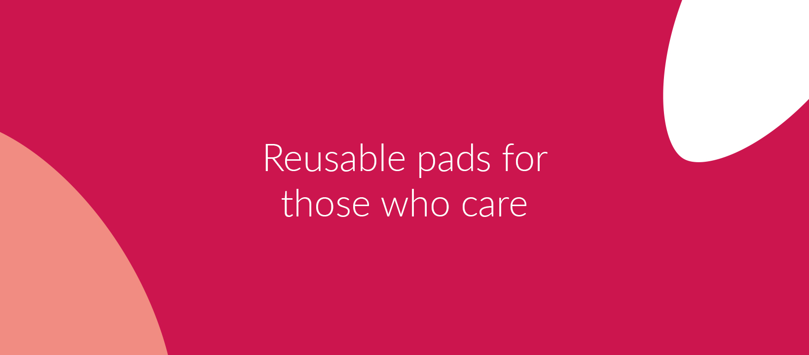
There was yet another important item on Luis’s checklist: everyone in the Project Team was comfortable in using “Be comfortable in your choices” (notice the inception there) as a tagline, but we felt that the brand also needed a descriptor. Something that was more to the point, and guaranteed that customers would clearly understand what our product was all about while remaining true to our - already quite defined - emotional tone of voice. “Reusable pads for those who care” was the phrase that did the trick.
TL;DR -> Thematic Exploration framework -> a whole lot of sketching -> benchmarking (competitors colour analysis) -> developing “Emma Watson-inspired” tone of voice -> creating a descriptor
Learnings: Direction and Exploration
- The Thematic Exploration framework was not as accessible to someone with no design expertise as we wished for.
- Responses and client participation were more limited than we hoped, because of that.
Improvements:
Not only did we take the time (during the project) to redesign the framework, but we decided to look at our whole process as well. We did it from the perspective of someone with no design background whatsoever, carefully reducing the amount of technical language and making the activities more accessible.
These changes ensure that we can maintain a high level of collaboration that Double-W is built upon, regardless of our clients’ experience.
Phase 3: The Brand
Refinements... and some more refinements
Everything was going according to plan: the verbal language was pretty much defined; we had a shape for the logo, a basis for the lettering and a chromatic direction. It felt like 80% of the design work was done. But… we are perfectionists and the final 20% can get as intense as the rest of the process. We know that to give it an extra push (or rather multiple pushes) in this phase is how we can deliver a brand that really feels “finished”, doing justice to the comprehensive brand strategy.
So, Alex - the main polisher in charge - kept working on the shape, giving it a rounder, more inviting shape, that better fit the personality of the brand. There was also a great deal of attention being put into the “inside Y” of the logo. It might seem like a small thing but to us, it could make or break the whole visual identity. We felt like this was the single most unique shape within the whole logo and the best opportunity we had to not only make it unique but also portray some imperfection, adding humanity and personality to the overall design. As always, the client team was able to keep up with this process and got to choose between various iterations of the logo.
When the whole Project Team was comfortable with a shape, there were more decisions to be made. This time, regarding colour. During the direction and exploration phase, we arrived at two main colours: this deep red and a peach-like orange. After some testing, we kept refining them - and going over all of the changes and options with the Client Team, which was also very thorough in this process - changing “almost unnoticeable” values in both colours, until we reached truly bespoke brand colours. Lilypads’ crimson and coral colours naturally fit within the chromatic landscape of the product category, but they also have this unique quality to them that helps the brand differentiate from the competition.
Lettering is all about the details. Alex and Tom (Double-W’s product owner, who also helped oversee the whole process) spent a lot of time tweaking and rearranging all of the letters. Believe it or not, we had intense discussions around just the tail of the “y” in Lilypads! But, in the end, it was worth it. Lilypads’ lettering feels unique and true to the brand’s friendly personality.
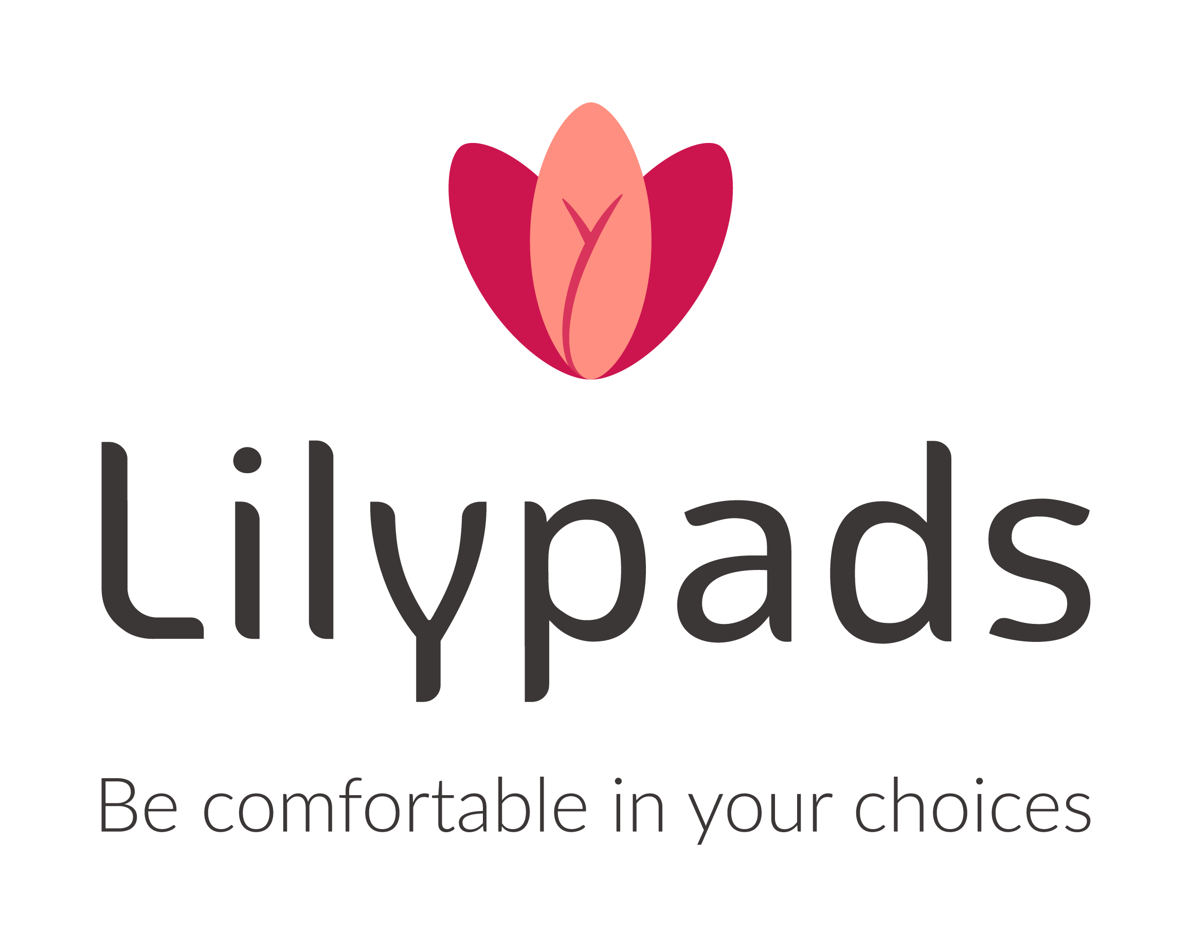
Lilypads’ logo was done, but the work was far from over. To us, a brand is only finished when our clients are able to use it by themselves, to its full potential. Our Brand Guidelines Manual ensures just that through clear, bespoke instructions and real-life usage examples, both visual and verbal. The creation of some deliverables - an investor deck and presentation template, and some graphic elements for social media - was also in the briefing, and we used that opportunity to develop a visual language around another unique element of the brand: the petals. We decided to develop these deliverables in parallel to the Brand Guidelines Manual, since the document itself also served to explore the visual language.
TL;DR-> Logo refinements -> colour picking -> crafting the lettering (and choosing typography) -> creating Brand Guidelines Manual -> designing some other deliverables -> delivering the brand
Learnings: The Brand
- We underestimated the time needed for the brand development and creation of deliverables
Improvements:
In order for people to create their best work, they need time. We have increased the minimum possible time for this phase for all future Double-W projects.
In the end, we were honestly proud of the whole process. Together with Alison, Mhairie and Bronnie, we designed a brand that felt unique, different to anything else in the market while remaining true and natural to the people behind the brand and successfully reflected the noble mission that started Lilypads’ incredible journey.
Liked that? Check these out:
- by Thomas Walker & Luís Medeiros


